


Synergy between dashboards and reports enhances healthcare analytics for better patient care. Dashboards provide real-time, visual summaries of key metrics and KPIs for immediate decision-making. On the other hand, reports delve deeper into analyzing trends and underlying causes to inform strategic planning. This article aims to explain how these tools complement each other, using examples, such as patient outcome monitoring and hospital resource management, to demonstrate their distinct yet interconnected roles.
Design of healthcare dashboards
Dashboards help users quickly grasp the current state. They present data in an easy-to-understand format for rapid consumption of information.
Principles for designing functional dashboards
1. Choose data points that apply to the user's role and responsibilities. Consider the decisions they have to make, such as resource allocation, staff management, and ensuring clinic financial viability. Use these answers to select your dashboard data content.
2. The dashboard should display information immediately on opening without requiring user input. Avoid scrolling by making important information visible for quicker access.
3. Similar to a car dashboard that directly shows speed and fuel level with no button pressing, healthcare dashboards are created to represent critical information instantly.
Labels on the dashboard should be self-explanatory, so users don't require extensive training to understand them.
4. Consider the user's cognitive workload. It is important to find the right balance of metrics. Too many can overwhelm the user, while too few may omit critical information. Differentiate the importance of data and guide the viewer's attention to the most decisive information using techniques like size, positioning, and contrast. For each type of data, understand the categories it falls into - such as revenue streams, types of services offered, patient demographics, and more.
5. Apart from presenting comparative data, provide proactive context by anticipating the user's next question. For example, if a metric is underperforming, the dashboard can reveal straightaway insights into potential explanations.
6. The non-evident principle is to tailor labels and navigation of the user's familiarity with the subject, avoiding technical jargon that might confuse non-expert users.
By implementing these principles, healthcare dashboards are customized to address specific goals that are vital for both patient care and operational efficiency. For example, to enhance patient outcomes, reduce readmission rates, increase patient satisfaction, and ensure timely care, dashboards can effectively display key metrics, such as patient recovery times, satisfaction survey scores, and average lengths of stay. This utilization of dashboards for a single-screen, quick monitoring allows healthcare professionals to make informed decisions at a glance, demonstrating the practical application of the design principles outlined above.
Check out our Healthtech Company case study to learn how we used AWS to improve healthcare analytics. It illustrates how cloud technology can enhance data management for dashboards and reports. Find out more in the full study.
With our expertise in GDPR and HIPAA-compliant software development, we can assist with healthcare dashboard and report customization. Contact us today for a consultation.
These characteristics qualify this visual as a dashboard:
1. The use of graphs and charts to provide quick visual summaries of data.
2. It displays various data points, such as occupancy rate, length of stay, and revenue, across different time frames and comparisons. This is typical for a dashboard aiming to give a comprehensive snapshot of performance.
3. It compares current data to historical data, like the current year versus the previous year, which is useful for monitoring ongoing performance against benchmarks.
4. The information is curated to focus on key metrics that are most relevant to the viewer, which is a hallmark of a well-designed dashboard.
Let's break down the key elements of the Hospital CEO Dashboard and interpret the data displayed.
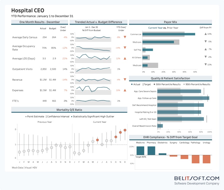
Average Daily Census
Shows the number of patients in the hospital each day. The actual number is slightly below the budget, suggesting fewer patients than expected.
Average Occupancy Rate
The rate is below the budgeted target, indicating that the hospital has more capacity than it's currently using.
Average Length of Stay (LOS)
The actual LOS is higher than expected, meaning patients are staying longer in the hospital than planned, which could indicate more severe health issues or a delay in discharge processes.
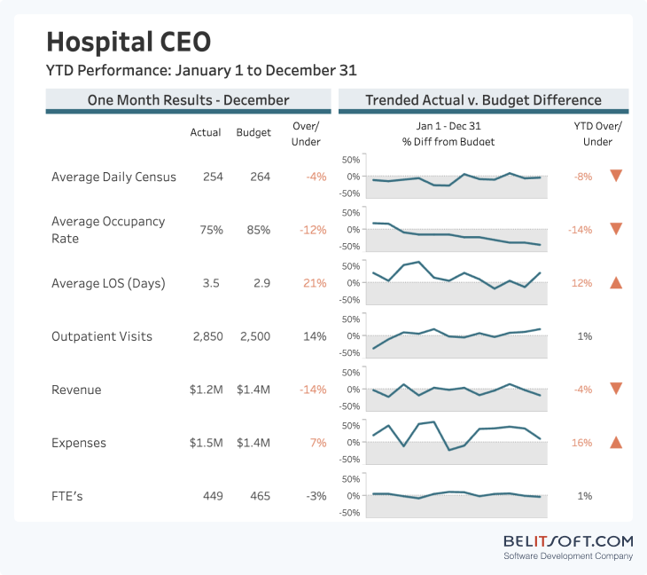
Outpatient Visits
Slightly above the target, suggesting good performance in outpatient services.
Revenue and Expenses
Revenue is below, while expenses are above the budget, showing financial challenges.
FTEs
The actual number of full-time staff is lower than the budget, which might affect the workload distribution.
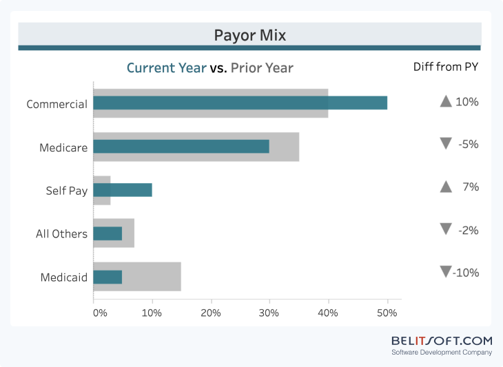
Payor Mix
Represents a shift in the types of insurance coverages compared to the previous year, with an increase in commercial and self-pay and a decrease in Medicare and Medicaid. This could affect the hospital's revenue and reimbursement rates.
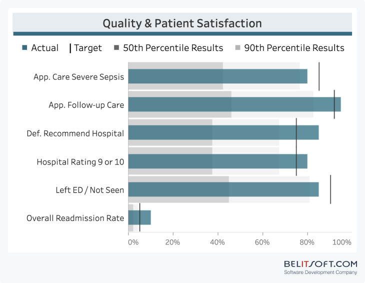
Quality & Patient Satisfaction
The bars depict different quality metrics, with the actual performance compared to targets and percentile results. The hospital seems to be meeting or exceeding targets in most areas, but there is room for improvement in patient follow-up care and hospital rating.
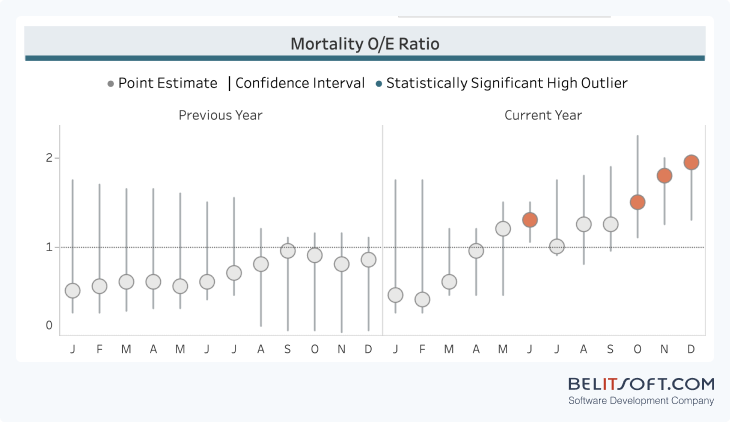
Mortality O/E Ratio
Shows the ratio of observed to expected deaths. Points falling outside the confidence interval suggest areas where the hospital's mortality rate is higher than expected, warranting further investigation.
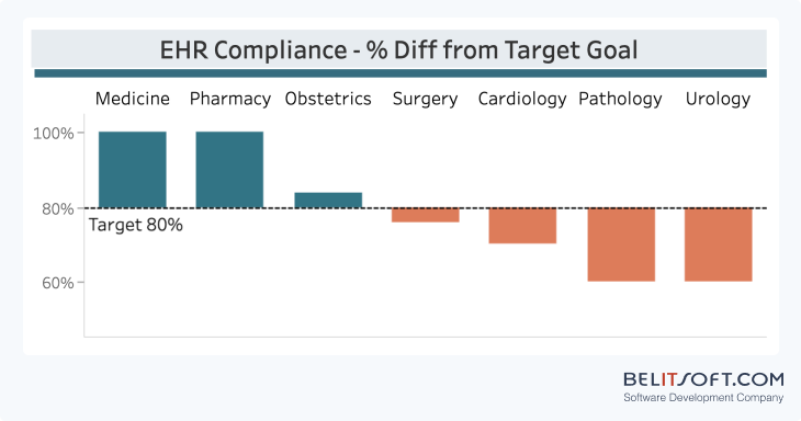
EHR Compliance
Depicts how well different departments are meeting EHR usage goals. Medicine and Obstetrics are under the target, which could impact patient care quality and data recording practices.
Overall, the dashboard shows positive patient care and satisfaction, but financial concerns and performance improvements are needed in specific departments. The CEO can use the dashboard as a decision support tool to identify areas that need attention and allocate resources effectively.
Real-world scenarios can apply these concepts. For example, an Israeli Digital Health software company used these design strategies to enhance their SaaS product. They integrated Electronic Health Records (EHR) with patient-generated data. Find out how custom dashboards and reports can improve patient care and operational efficiency, in our detailed case study.
Design of healthcare reports
Due to their summary nature, dashboards cannot capture every detail or nuance of the data. They prioritize brevity and immediacy over depth, potentially omitting critical details.
To complement the high-level overview provided by dashboards, detailed reports are necessary. These reports delve into the specifics behind the summary metrics displayed on the dashboard. They provide the "why" and "how" behind the numbers, offering explanations for trends, and anomalies that dashboards might flag but not fully explain. This contextual information is vital for users to understand the underlying factors affecting the metrics.
Reports are more thorough than dashboards. They are structured to explore and explain the context, contributing factors, and potential implications of the data in depth.
For example, a Hospital Readmission Analysis Report may include analyzing trends over time and comparing current rates to previous periods. It can also break down readmissions by diagnosis or procedure to identify areas with the highest rates. Additionally, it can examine readmission rates by patient demographics, such as age, gender, and socioeconomic status.
Through detailed data analysis, reports provide stakeholders with a clear picture of an issue, equipping them to make informed decisions. This contrasts with the role of dashboards, which primarily alerts and informs about current states or changes.
Our expertise goes beyond healthcare dashboards and reports, providing tools to extract actionable insights from complex data sets. Check our detailed guide to explore our approach to healthcare application development and the ways we can enhance your healthcare software for compliance standards and patient satisfaction.
Principles for designing functional reports
1. Reports are known for their variable length, often resulting in the need for scrolling. Conversely, dashboards are crafted to give notifications and updates regarding existing statuses or alterations.
2. Dashboards are typically updated in real-time or near-real-time to reflect the most current data. Reports, on the other hand, can provide both timely resources with the most current data and historical records that document data states at specific time points, thus offering a broader range of perspectives.
3. The reports' structure and features allow for a depth of information, setting them apart from the summary-oriented nature of dashboards.
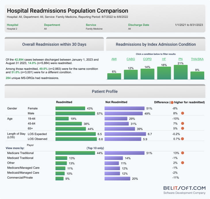
This report focuses on the rate of patient readmission within 30 days post-discharge, serving as a vital indicator of care quality and hospital performance. It compares two distinct groups—patients who were readmitted against those who were not within this time frame.
Сomparing these two groups reveals differences in demographic variables, medical conditions, and treatments received, uncovering potential reasons for readmission.
To enhance the depth of analysis, the report incorporates interactive features, allowing users to filter data by hospital, department, service, and discharge date. This granularity enables healthcare teams to perform focused analyses, such as comparing readmission rates between orthopedic and medicine departments.
Further, the report highlights conditions frequently leading to readmissions, as recognized by the Centers for Medicare and Medicaid Services (CMS), presenting them in a bar chart for easy visualization.
Besides that, the report’s interactive elements extend to filters for payor, discharge status, and admission source, enabling adjustments to the displayed data for both cohorts.
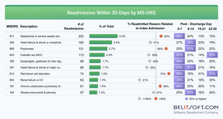
The bottom section of the report provides a detailed examination of the reasons behind patient readmissions, focusing on Medicare Severity Diagnosis-Related Groups (MS-DRGs).
By framing the data analysis around critical questions of "compared with what?" and "so what?", the report goes beyond presenting facts and provides a narrative rich with interpretation.
Based on the provided screenshots of the hospital readmission reports, several insights can be derived.
Readmission Rates
Of the 42,894 cases, 10.4% (5,884) were readmitted within 30 days. This points to the hospital’s performance in terms of patient readmissions.
Condition-Specific Readmissions
The section on readmissions by index admission condition reveals that specific conditions, like heart failure (HF) and total hip/knee arthroplasty or replacement (THA/TKA), have higher readmission rates. These areas could be focused on for improvement efforts.
Demographic and Stay Duration Factors
The patient profile comparison reveals that older patients (65+) and males are more likely to be readmitted. There appears to be a slight variation in the length of hospital stays between the groups that were readmitted and those that were not, implying that the duration of the initial hospitalization affects the probability of readmission.
Readmission Timing
The MS-DRG section at the bottom of the second screenshot shows that, for many conditions, readmissions occur more frequently in the first week post-discharge. This suggests the need for better post-discharge care and follow-up during the immediate recovery period.
Correlation with Initial Admission
A significant percentage of readmissions are related to the index admission, especially for conditions like psychosis and heart failure. This suggests that the reason for admission is a powerful predictor of readmission and may require targeted post-discharge protocols.
Financial and Insurance Factors
Different payor mix for readmitted patients implies that insurance type affects readmission rates. For instance, traditional Medicare patients have a higher readmission rate compared to those with commercial/private insurance.
Use of Visual Cues
Orange dots highlight where readmitted patients have notably higher percentages compared to those not readmitted. This visual cue draws attention to significant disparities, such as a higher percentage of heart failure in readmitted patients.
Most Common Readmission Conditions
The MS-DRG section lists the most common conditions that lead to readmission, and septicemia or severe sepsis with complications is the top condition. This highlights specific areas where the hospital could focus on readmission reduction.
Potential Quality Improvement Areas
These reports can help identify areas for quality improvement, such as enhancing care for heart failure or sepsis patients, supporting older patients, or reviewing discharge planning and follow-up procedures.
Data Accessibility
With clickable filters, the interactive design facilitates efficient data navigation and analysis for strategic planning.
Dashboards and reports are both essential for healthcare analytics. Our case study, EHR CRM Integration and Medical BI Implementation for a Healthcare Network, demonstrates this balance in action showcasing how the integration of Business Intelligence (BI), Customer Relationship Management (CRM) and Electronic Health Records (EHR) significantly enhances medical outcomes and cost efficiency. By analyzing data from EHRs, the developed software generates in-depth reports detailing patient demographics, treatment outcomes, and temporal trends. These reports clarify metrics and provide insights for healthcare professionals in patient care, strategic planning, and improvement.
Enhance your healthcare organization's decision-making with expertly designed dashboards that provide real-time insights. Contact us to discuss your project with our team.

Rate this article
Recommended posts

.jpg)
Our Clients' Feedback


They use their knowledge and skills to program the product, and then completed a series of quality assurance tests. We were working in an agile way with them. Belitsoft performed very well throughout our project. We are definitely looking at Belitsoft as a long-term partner.

Service Delivery Director at Crimson (United Kingdom)
I highly recommend Belitsoft for website design and development. We were up against a tight deadline to launch the project. The work was delivered on time and within budget! I will continue working with Belitsoft as a valued partner for our web development!

Program Administrator at UC Berkeley (United States)
We have worked with Belitsoft team over the past few years on projects involving much customized programming work. They are knowledgeable and are able to complete tasks on schedule, meeting our technical requirements. We would recommend them to anyone who is in need of custom programming work.

Main Partner at Hathway Tech (United States)
Belitsoft company is able to make changes instantly. One of our internal engineers has commented about how clean their code is. Belitsoft seems to know what they're doing, which I appreciate.

Co-Founder at HOWCAST MEDIA (United States)
It was a great pleasure working with Belitsoft software development company. New requirements and adjustments were implemented fast and precisely. We can recommend Belitsoft and are looking forward to start a follow-up project.

Head of Division at Fraunhofer FIT (Germany)
Belitsoft company has been able to provide senior developers with the skills to support back end, native mobile and web applications. We continue today to augment our existing staff with great developers from Belitsoft.

CEO at Apollo Matrix (United States)
Belitsoft company delivered dedicated development team for our products, and technical specialists for our clients' custom development needs. We highly recommend to use this company if you want the same benefits.

Managing Director at Key2Know A/S in 2012 (Denmark)
We approached BelITsoft with a concept, and they were able to convert it into a multi-platform software solution. Their team members are skilled, agile and attached to their work, all of which paid dividends as our software grew in complexity.

COO at Regenerative Medicine LLC (United States)
Having worked with Belitsoft as a service provider, I must say that I'm very pleased with the company's policy. Belitsoft guarantees first-class service through efficient management, great expertise, and a systematic approach to business. I would strongly recommend Belitsoft's services to anyone wanting to get the right IT products in the right place at the right time.

CEO at Moblers (Israel)
If you are looking for a true partnership Belitsoft company might be the best choice for you. They have proven to be most reliable, polite and professional. The team managed to adapt to changing requirements and to provide me with best solutions. I strongly recommend Belisoft.

Director at ShowCast Limited (Germany)
I expected and demanded a lot of you at Belitsoft company, but you exceeded my expectations. You acted pro-actively, challenged me at the right moments. Thanks!"

CEO at Ticken B.V. (Netherlands)
We have been working for over 10 years and they have become our long-term technology partner. Any software development, programming, or design needs we have had, Belitsoft company has always been able to handle this for us.

СEO at ElearningForce International (United States/Denmark)
Belitsoft has been the driving force behind several of our software development projects within the last few years. This company demonstrates high professionalism in their work approach. They have continuously proved to be ready to go the extra mile. We are very happy with Belitsoft, and in a position to strongly recommend them for software development and support as a most reliable and fully transparent partner focused on long term business relationships.
Global Head of Commercial Development L&D at Technicolor