


mHealth is becoming a popular option in the world today where there is a widespread gadget usage. People are frequently thinking about healthy lifestyles and ways to improve their well-being. As a result, they download dozens of healthcare apps to be motivated and track physical and mental conditions. Fortunately, software providers do have much to offer for both Android and iOS users. Do you want to create a competitive mHealth product? Have no idea what color scheme to pick for attracting more users? Looking for original design solutions? Check out this blog post to find a "best fit" design approaches in healthcare mobile development.
Mobile health is a growing IT sector that focuses on transforming how healthcare providers interact with their patients. According to Zion Market Research, the global mHealth market size is expected to reach $102.43 billion by 2022. Industry experts predict that 70% of healthcare organizations will invest in healthcare mobile app development by 2018.
‘The market for digital health tools is finally starting to catch up to the demand. Unfortunately, this increase can lead to a surge in unreliable tools. Nearly half of consumers today are considered digital health adopters—and that number is only going to rise as the benefits become apparent and tech-savvy generations get older.’
Nitin Goyal, MD, Orthopaedic Surgeon, Founder & CEO at Pulse Platform
The following statistic displays the number of mHealth apps available on Google Play. During the last measured period, the store offered just over 51.000 medical apps, representing a 5.7 percent growth over the previous quarter. The most income-generating mHealth apps on Google Play are fitness and calories counter systems.
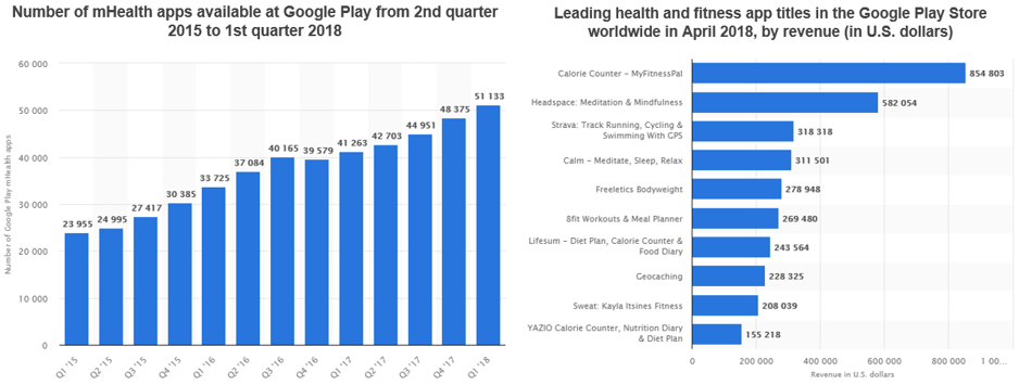 Source: statista.com/statistics/779919/health-apps-available-google-play-worldwide
Apps have become an essential part of the healthcare field. Medicare providers and patients all benefit from up-to-date, user-friendly, and free or minimal-cost healthcare apps. Due to rising supply, it has become increasingly important to offer a high-quality product.
Thus, designing mHealth apps that provide efficient and convenient ways of providing healthcare services is among the top-most concerns of developers.
In this article, we talk about what colors are best suited for healthcare mobile software and give you some examples. We then focus on app notification design. Surely we compare iOS and Android design style and show you some key differences with actual screenshots. Finally, we refer to best practices to customize your app for users with disabilities.
Have an idea to create an mHealth app? Contact us to start your business!
Familiarizing with colors
As part of the development process, it is necessary to choose a proper color scheme and fonts. Users should feel peaceful with confidence that they run a right medicare software to address their needs and concerns. To that end, vibrant colors should be replaced with a more delicate and calm color palette. Fortunately, there are many hues to pick from both cold and warm sides of the spectrum.
Cold tones are most often used for the background. These hues establish an overall sense of tranquility that is necessary to help users concentrate on the more important features of the healthcare app.
White
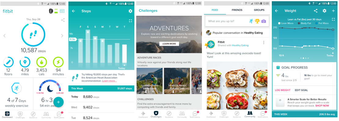 Fitbit - an activity tracker for iOS and Android
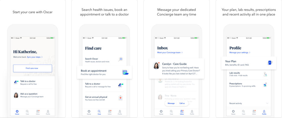 Oscar Health - a health insurance app for iOS and Android
Blue
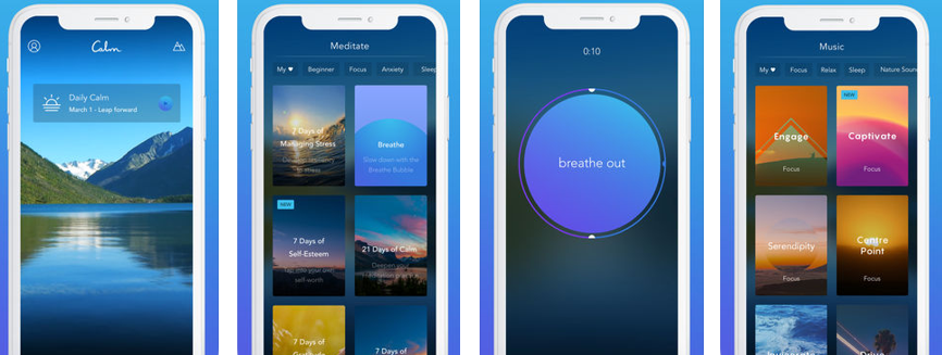 Calm - a meditation app
 A pharmacy app by Lewis+Humphreys
Grey
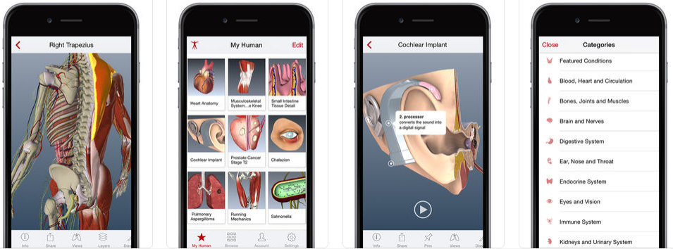 BioDigital - a 3D health visualization system
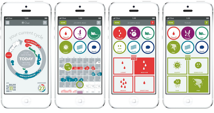 Clue - a female health app
Green
 Omada - a behavior change program
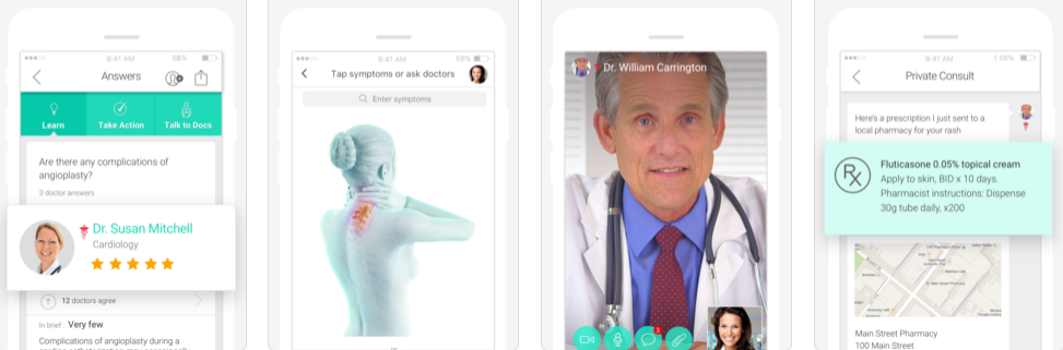 HealthTap - an online doctor consultation app
Warm tones are great for accent colors and for attracting attention. However, products designed in this color scheme as their dominant may be used in obstetrics and gynecology. All because in Europe and the USA, pink is often associated with the women.
Pink
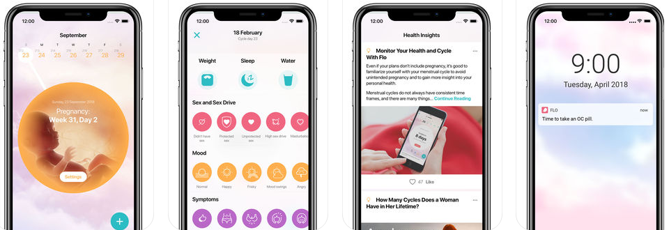 Flo - a fertility and pregnancy calendar
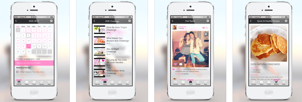 Blogilate - a fitness app
Purple
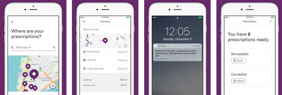 Zipdrug - a medication delivery app
 Cliniklik healthcare app design by Pablo Barzet, Source
Yellow
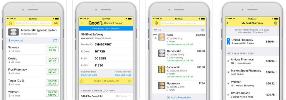 GoodRX - a drug price tracking app in the USA
Red
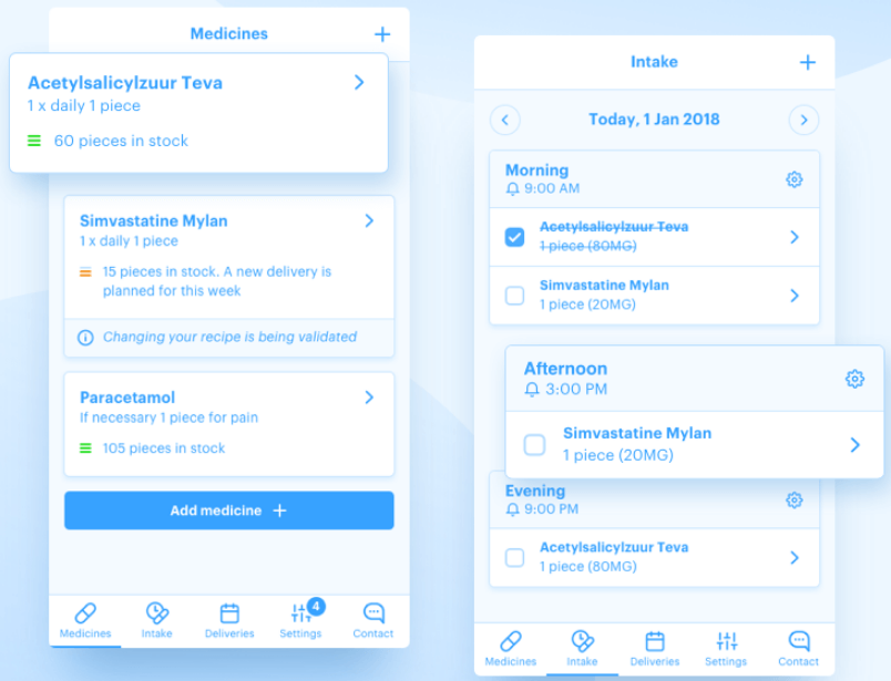
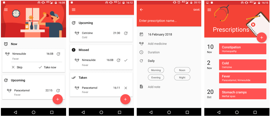 Pills On Time - a medication reminder and pills tracker
Orange
 MINDBODY - fitness, salon and spa booking app
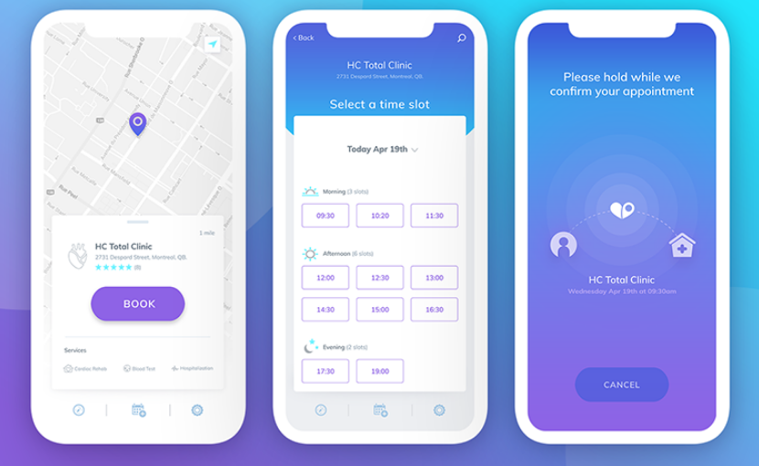
App notification design
Notifications are crucial to mHealth apps, especially for those that provide tracking and reminders. Giving them different designs enables indicating importance and urgency.
For example, an app reminds users of their scheduled time to take a pill. Along with this, it also notifies of an upcoming physician’s appointment. To avoid confusion and highlight relevance, developers have to give the reminders various design elements. To this end, they can use color-coding, font choices, gestures, or notification behavior/animation.
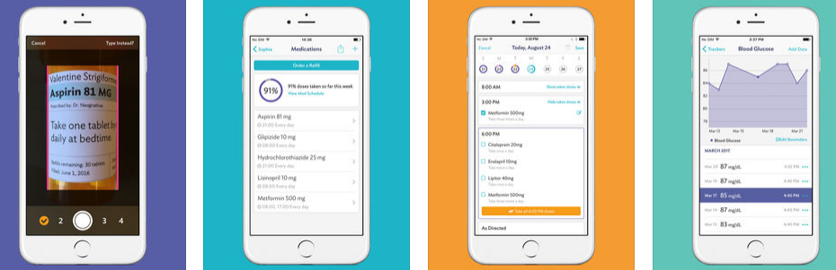 CareZone - a medication management app
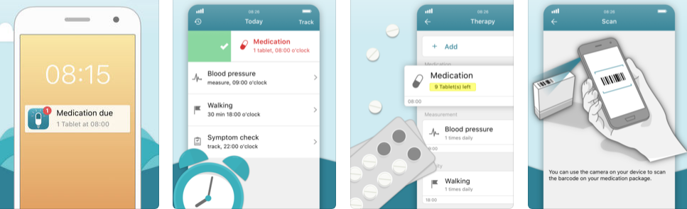 MyTherapy - a medication reminder and pill tracker
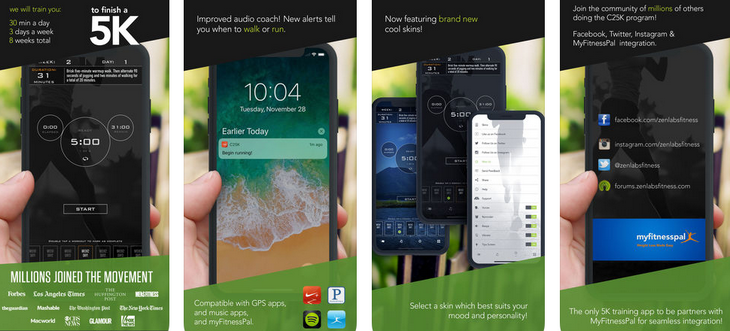 Couch to 5K - a running trainer
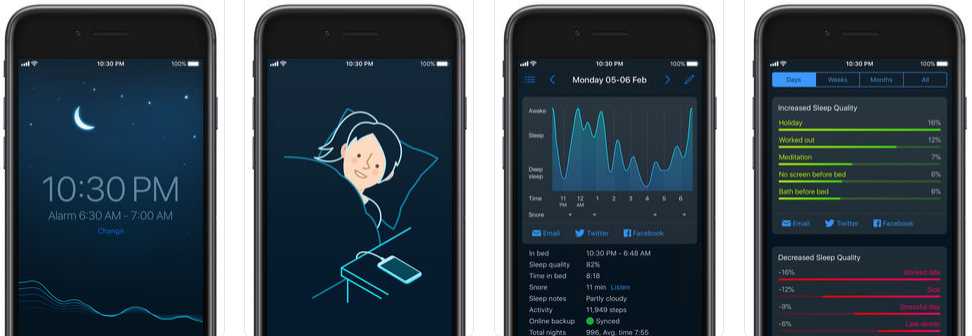 Sleep Cycle - an intelligent alarm clock
For our take on healthcare software development take a look at the latest EHR we've developed. This article give insights into the approach we used: How to Build an EHR System
Android vs iOS: Different design styles
Most popular apps, including mHealth, are released for both iOS and Android. The following are some differences to be taken into account when developing a mobile app.
— First off, the design rules for Android devices are determined by Material Design, while for iOS - by Human Interface Guidelines. The first one is based on a layered "paper" approach providing more hierarchy with realistic shadows, light, and motion. As for iOS, designers can use the effects of transparency, blurring, gradients or shadows to attract users attention.
— Moving between screens is a common action users take on apps. On Android, there is a universal navigation bar at the bottom. The back button is the simplest way to go back to a previous screen and it works in all apps.
 Runtastic Balance Food Tracker and Calorie Counter for Android
The vision on iOS is a little different. As can be seen on the screenshot below, there is no back button here. Thus, the app screen has a button on the top left corner. Moreover, designers can also use the name of the previous page behind the back icon to let customers know where they will go back.
 Runtastic Balance Food Tracker and Calorie Counter for iOS
In addition, Apple introduced a gesture of swiping from left to right in apps to go back.
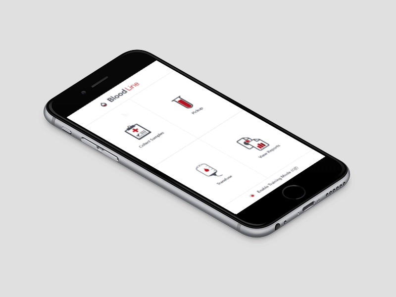 The animation for the collecting samples flow for Bloodline for iOS by Bryce Thompson, Source
— Apps have different areas within them, usually organized as tabs. Different sections on Android are displayed on top of the app. In addition, the Android version shows only icons on the tab row, whereas the iOS version also has labels.
However, iOS app’s sections are organized as tabs on the bottom of the screen.
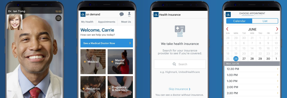 Doctor On Demand for Android
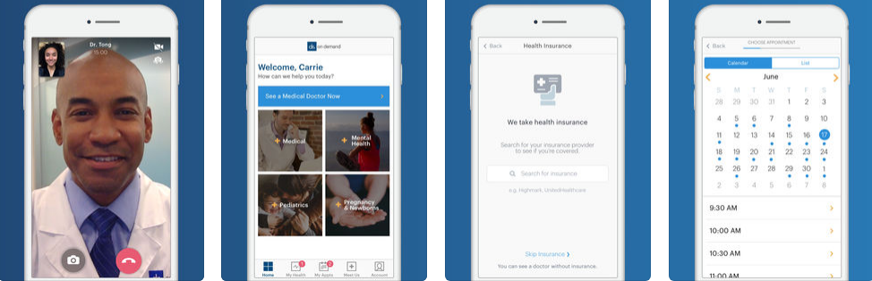 Doctor On Demand for iOS
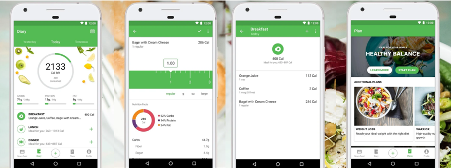
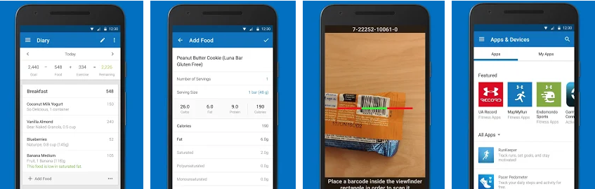 MyFitnessPal for Android
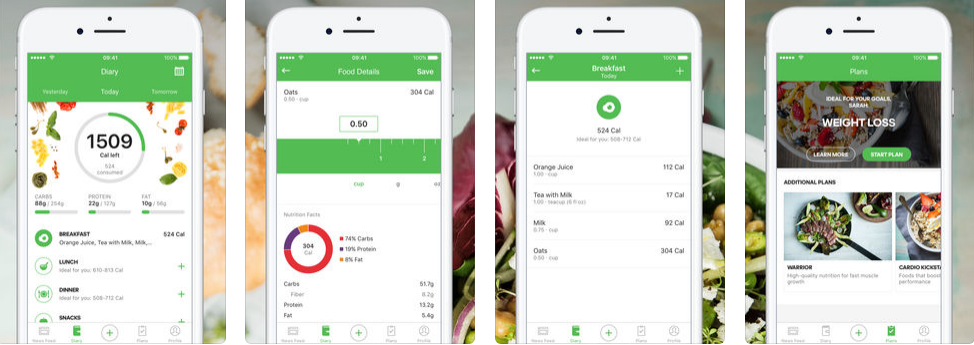
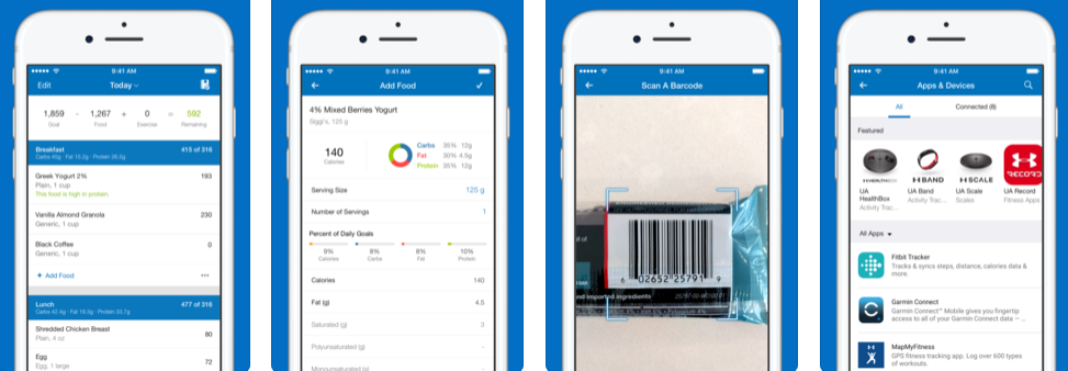 MyFitnessPal for iOS
— Action buttons are those that enable users to take some actions like share, upload/download etc. Both Android and iOS have their own icon styles.
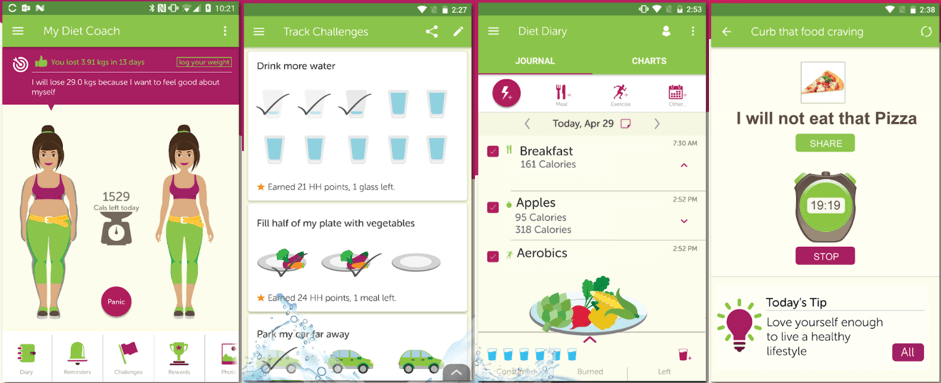 My Diet Coach - a weight loss motivating and tracking app for Android
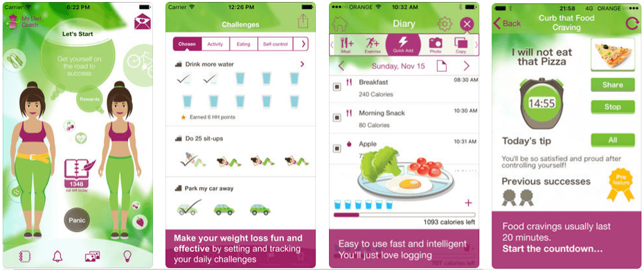 My Diet Coach for iOS
Understand target audiences
A proper quality design is important for any mobile app, but it’s especially vital when creating a program for sensitive target users.
‘I’m not the first entrepreneur to create a digital health app for patients. But as a surgeon, I’m very aware of the day-to-day issues that arise, including the nuanced relationship between patient and provider. Not all entrepreneurs in digital healthcare have this level of awareness. That means some digital health tools don’t consider a patient’s best interest.’
Nitin Goyal said
The following are some obstacles disabled users have met:
- Blind people may use screen reader software or Braille devices to access content but only text-based.
- Deaf users cannot access audio content unless it is transcribed.
- People who can’t use a mouse have to able to access content with a keyboard alone.
- Users with low vision, dyslexia, or attention deficit are difficult to process extensive texts and require more white space, simple screen images, and proper color contrast.
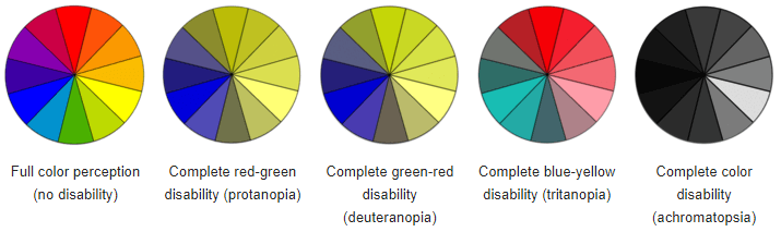 Examples of color disabilities
 Site: w3.org/WAI/GL/low-vision-a11y-tf/wiki/Overview_of_Low_Vision
Since this field is mainly represented by older people, or who might have sensory impairments and other disabilities or technically challenged, it’s necessary to tailor healthcare mobile app design.
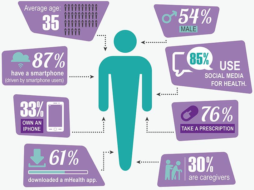 Source: greatcall.com/greatcall/lp/is-mobile-healthcare-the-future-infographic.aspx
Designing for low- and no-vision and hearing: legislation
Developing software that can be used by all people without the need for adaptation or specialized design is called “universal design”. Many software companies, unfortunately, focus on the characteristics of the “average” user.
‘The term user experience is now widely used, especially by major players in the industry including Apple, IBM and Microsoft. However, in many cases, the term is contrasted to usability which is often depicted as a much narrower concept focusing on systems being easy to use.’
Tom Stewart, Chair of the ISO sub-committee
With a view to making software accessible for people with disabilities, the U.S. Congress has passed legislation in a range of areas. Section 504 of the Rehabilitation Act of 1973 and its amendment 508 suggested in 1986 require that information technology funded/used by the federal government must be designed to be accessible to people with disabilities.
The Americans with Disabilities Act of 1990 (ADA) and ADA Amendments Act of 2008 require public software be accessible to users with physical, sensory, or cognitive disabilities, regardless of what audience is targeted. In 2017, the U.S. Access Board published a final rule updating accessibility requirements for information and communication technology (ICT). Further, it boosts international harmonization, in particular with Canada, Germany, France, Australia, New Zealand, and Japan.
Designing for low- and no-vision and hearing: best practices
The “mobile accessibility” standards address devices that interact with the web, including smartphones, tablets, and wearables. Most often, mobile devices have a small screen size that limits how much information users can actually view at one time. Especially, when zoom is used by people with low vision.
Some best practices for helping low-vision users to make the most of small screens include:
Cut the amount of the displayed content by providing a dedicated mobile version (providing fewer content modules, fewer images, or focus on important mobile usage scenarios) or a responsive design (on narrow screens the navigation menus may be hidden until a user taps a menu button).
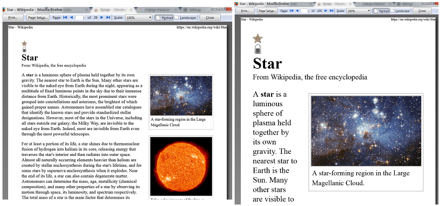 The left picture shows a page with no modification, print preview at 100%. The picture on the right shows the same page at 200%.
Source: w3.org/WAI/GL/low-vision-a11y-tf/wiki/Printing_Customized_Text- Provide a reasonable default size for content and touch controls to prevent text magnification by the user. The content has to be resizable without assistive technology up to 200 percent.
Supply with on-page controls to change the text size (e.g. magnifying lens view under user’s finger).
 Source: pcworld.com/article/3131925
- Avoid using complicated and decorative fonts because they can be discerned much harder. Use standard fonts like Arial or Times New Roman instead.
- Create alternative CSS with a highly contrasting color scheme. The WCAG 2.0. suggests Minimum (at least 4.5:1 or 3:1 for large-scale text) and Enhanced (at least 7:1 or 4.5:1 for large-scale text) contrasts.
- Arrange interactive elements where they can be easily seen when the device is held in different positions.
Use a range of clearly contrasting colors and hues instead of relying on black and white as the design's only contrasting colors.
 Type1 Diabetes Mobile App Design
Source: behance.net/gallery/32173645/Type-1-Diabetes-Mobile-App- Avoid hard-to-see color combos, e.g:
- Green & red.
- Green & brown.
- Blue & purple.
- Green & Blue.
- Blue & Grey.
- Green & Grey.
- Indicate clearly interactive elements (buttons or links) from non-actionable elements (content, status info, etc.) through the following parameters:
- Conventional shape: rounded-corner shaded button shape.
- Iconography: question mark, home icon, back arrow, etc. for conventional visual icons.
- Color offset: various text color, shape with a different background color to distinguish the element from the page background.
- Conventional style: underlined text and different colors for links.
To ensure access to all potential audiences, it is essential that software companies develop products to be compatible with assistive technology. When a mobile app is designed to be accessible to users with a broad range of disabilities, the others benefit too. For example, video transcripts enable deaf users to access the content. However, this feature allows for viewing it in a noisy environment, or for whom English is a second language.
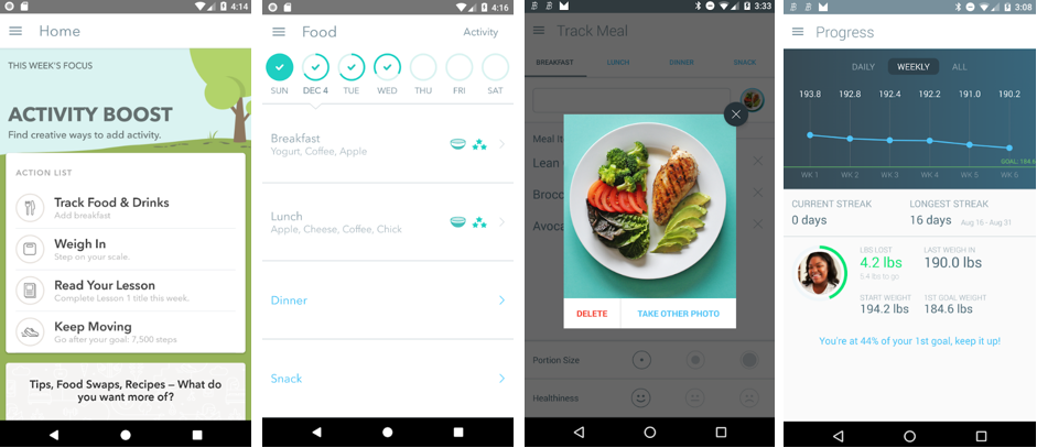
User-friendly design
An important step toward a successful UX design for mHealth apps is to practice simplicity. We’ve reviewed dozens of healthcare apps, both on Google Play and App Store, and noticed there is one thing in common: simplistic or minimalist design. Indeed, such programs give users a clean and professional experience.
‘Don’t re-invent the wheel. Use models and frameworks developed by others, and modify them as needed [...] and incorporate what has worked before. Once that framework is established, it’s easier to go in and add elements that personalize or brand the experience.’
Jeffery Kendall, SVP and GM at Kony
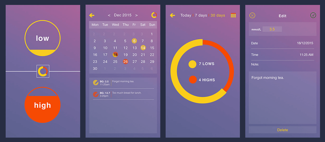
 Health tracking app by Jakub Antalík
 Source: dribbble.com/shots/2834322-Health-tracking-app-case-study
It is also essential to facilitate the register/sign-in process. User authorization has to take the minimum amount of time avoiding numerous screens and clicks. The simplification principle also applies to emergency data accessing, like doctor phone number, prescription medication, or allergies.
Icon sets used in healthcare apps should be highly intuitive so that users can easily understand what a particular icon means. However, more creative symbols can be added while including their description at hand. Thus, developers avoid the possibility of confusing their customers.
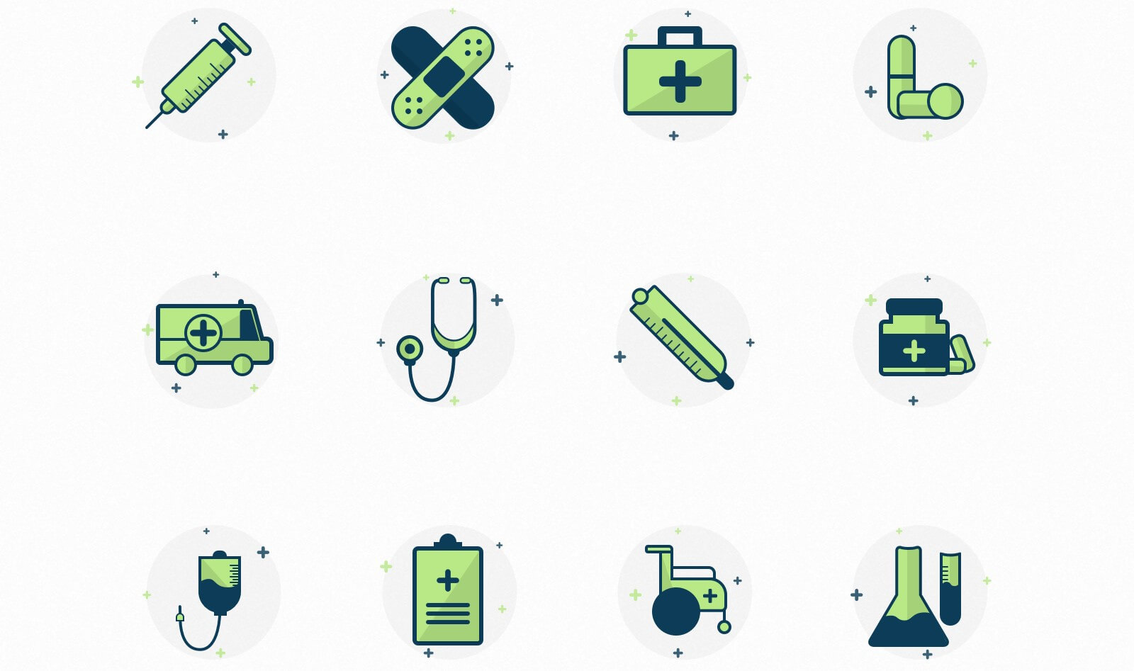 Medical Icon Set by Vivek Karthikeyan
Source: dribbble.com/shots/3121056-Medical-Icon-Set
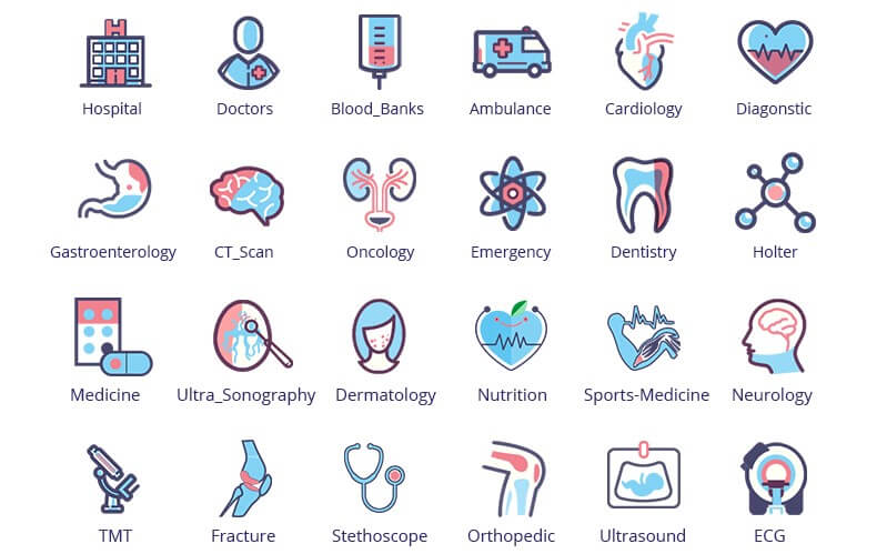 Medical Icons by Asif Hussain
Source: dribbble.com/shots/4131178-Medical-Icons
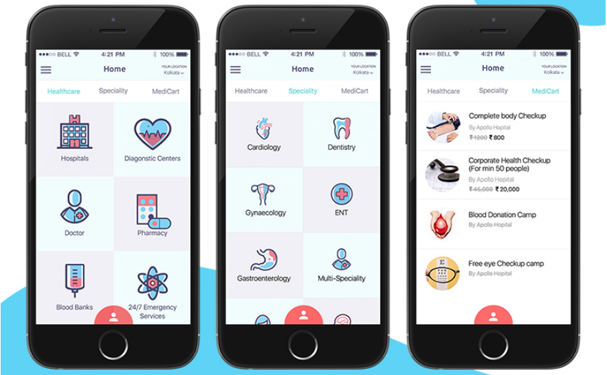 Complete Medical App by Asif Hussain
Source: dribbble.com/shots/4078004-A-Complete-Medical-Application
Conclusion
Designing an effective healthcare mobile app requires focusing on what works best for target audiences. Design should be centered around an intuitive UI/UX and proper coloring schemes. Moreover, to reach a wide audience, mHealth apps should be tailored for sensory impairment users.
You want your app to have a modern and harmonious look? Our talented designers will liven it up! Contact us for advice!

Rate this article
Our Clients' Feedback


They use their knowledge and skills to program the product, and then completed a series of quality assurance tests. We were working in an agile way with them. Belitsoft performed very well throughout our project. We are definitely looking at Belitsoft as a long-term partner.

Service Delivery Director at Crimson (United Kingdom)
I highly recommend Belitsoft for website design and development. We were up against a tight deadline to launch the project. The work was delivered on time and within budget! I will continue working with Belitsoft as a valued partner for our web development!

Program Administrator at UC Berkeley (United States)
We have worked with Belitsoft team over the past few years on projects involving much customized programming work. They are knowledgeable and are able to complete tasks on schedule, meeting our technical requirements. We would recommend them to anyone who is in need of custom programming work.

Main Partner at Hathway Tech (United States)
Belitsoft company is able to make changes instantly. One of our internal engineers has commented about how clean their code is. Belitsoft seems to know what they're doing, which I appreciate.

Co-Founder at HOWCAST MEDIA (United States)
It was a great pleasure working with Belitsoft software development company. New requirements and adjustments were implemented fast and precisely. We can recommend Belitsoft and are looking forward to start a follow-up project.

Head of Division at Fraunhofer FIT (Germany)
Belitsoft company has been able to provide senior developers with the skills to support back end, native mobile and web applications. We continue today to augment our existing staff with great developers from Belitsoft.

CEO at Apollo Matrix (United States)
Belitsoft company delivered dedicated development team for our products, and technical specialists for our clients' custom development needs. We highly recommend to use this company if you want the same benefits.

Managing Director at Key2Know A/S in 2012 (Denmark)
We approached BelITsoft with a concept, and they were able to convert it into a multi-platform software solution. Their team members are skilled, agile and attached to their work, all of which paid dividends as our software grew in complexity.

COO at Regenerative Medicine LLC (United States)
Having worked with Belitsoft as a service provider, I must say that I'm very pleased with the company's policy. Belitsoft guarantees first-class service through efficient management, great expertise, and a systematic approach to business. I would strongly recommend Belitsoft's services to anyone wanting to get the right IT products in the right place at the right time.

CEO at Moblers (Israel)
If you are looking for a true partnership Belitsoft company might be the best choice for you. They have proven to be most reliable, polite and professional. The team managed to adapt to changing requirements and to provide me with best solutions. I strongly recommend Belisoft.

Director at ShowCast Limited (Germany)
I expected and demanded a lot of you at Belitsoft company, but you exceeded my expectations. You acted pro-actively, challenged me at the right moments. Thanks!"

CEO at Ticken B.V. (Netherlands)
We have been working for over 10 years and they have become our long-term technology partner. Any software development, programming, or design needs we have had, Belitsoft company has always been able to handle this for us.

СEO at ElearningForce International (United States/Denmark)
Belitsoft has been the driving force behind several of our software development projects within the last few years. This company demonstrates high professionalism in their work approach. They have continuously proved to be ready to go the extra mile. We are very happy with Belitsoft, and in a position to strongly recommend them for software development and support as a most reliable and fully transparent partner focused on long term business relationships.
Global Head of Commercial Development L&D at Technicolor